Tripple Pluggers
A real online store build for an Australian product brand, focused on clearer product pages, easier mobile shopping, and a smoother path to checkout.
A live ecommerce store for an Australian footwear product brand.
Make product selection, mobile shopping, and checkout feel clearer and more trustworthy.
The store generated real traffic, checkout activity, sales, and customer orders.
Built to make the product easier to understand and buy
A product store has to do more than look good. It needs to explain the product, reduce confusion, build trust, and make the checkout path obvious.
The store needed to feel clearer, stronger, and easier to buy from
The goal was to make the store look more trustworthy, work better on mobile, and help shoppers move from browsing to buying without getting lost or second-guessing the store.
Cleaner product pages, better mobile shopping, and a smoother checkout path
The improvements focused on store structure, product presentation, variant selection, and a clearer path from product view to checkout.
A working ecommerce experience, not just a mockup
These screenshots show the storefront, product experience, and real store activity.
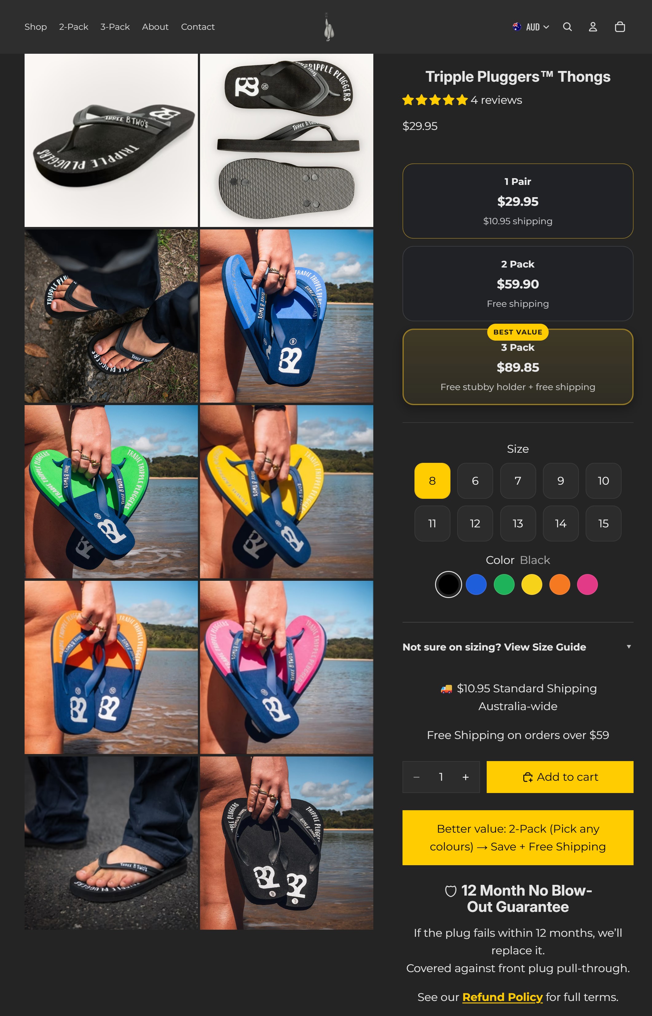
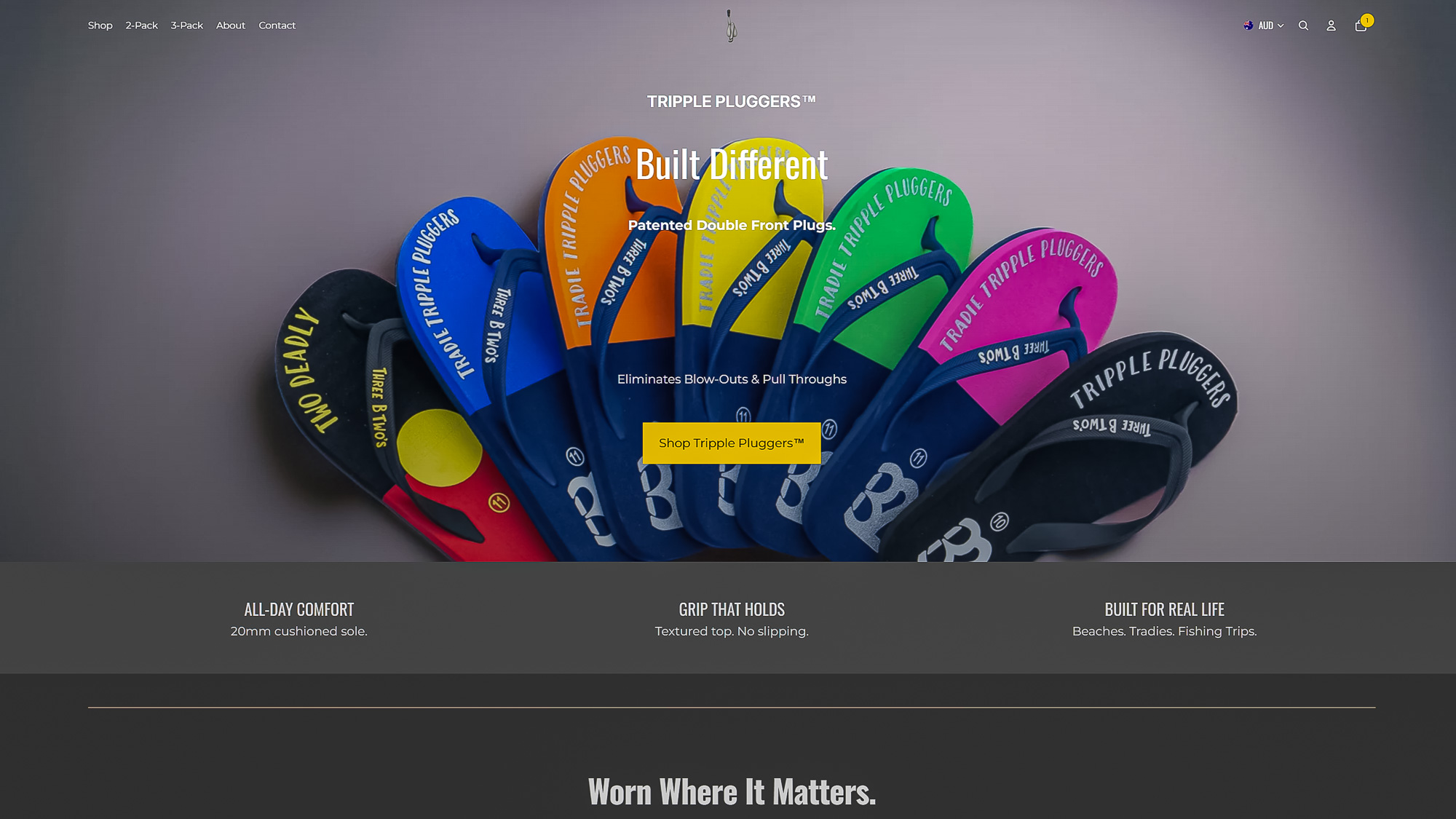
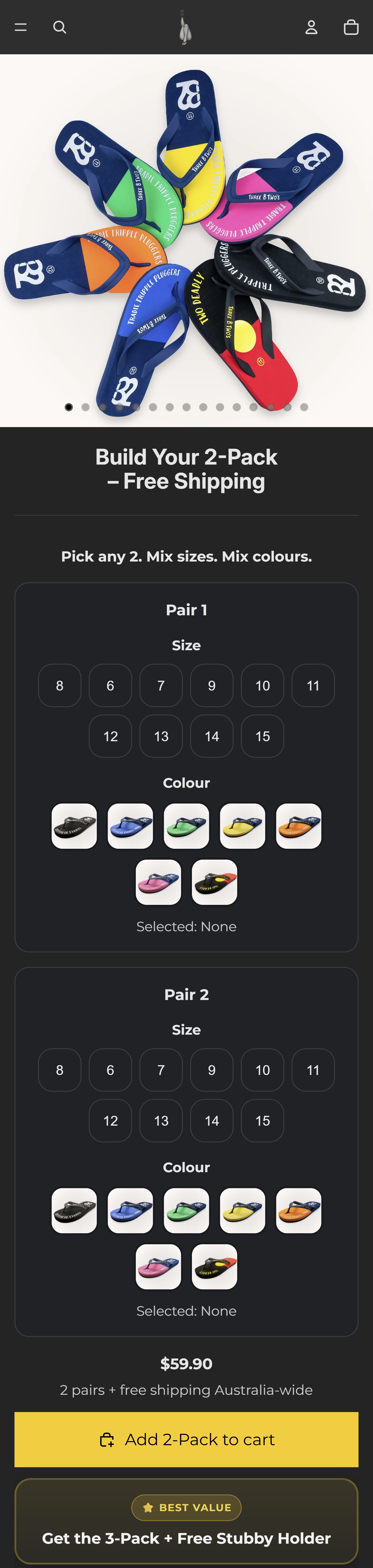
Desktop product page
A clearer product page layout helped make the offer easier to understand and gave shoppers a stronger buying experience on desktop.
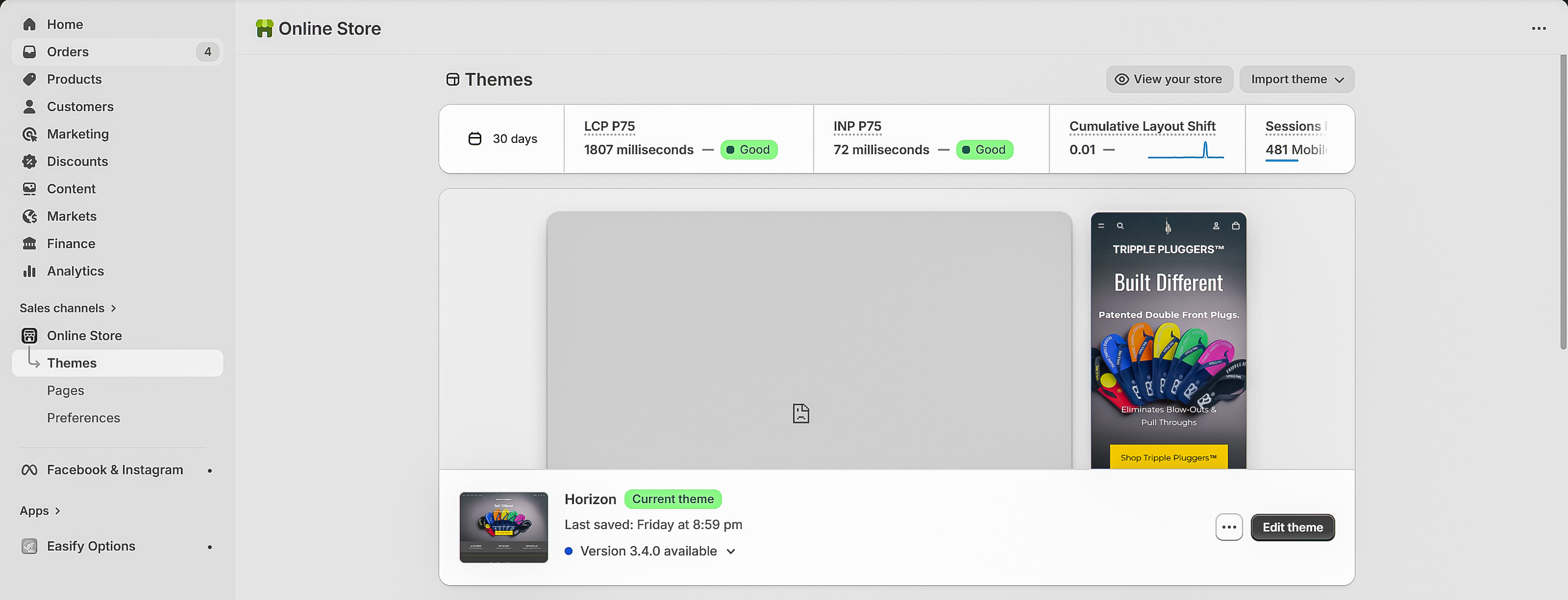
Real store activity
This was a working Shopify store with real traffic, real customer behaviour, and actual sales activity, not just a concept design.
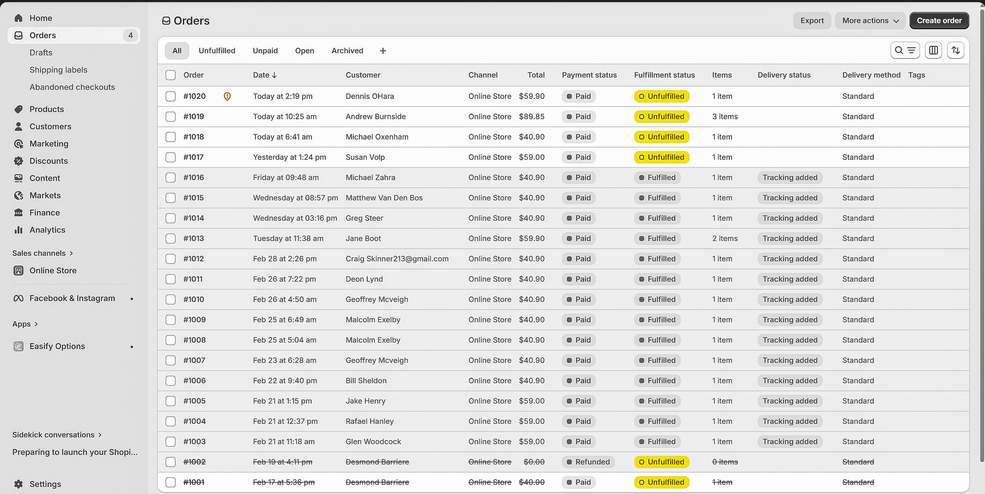
Orders and proof
The store generated real orders, which makes this project useful proof for ecommerce work, product pages, and conversion-focused improvements.
Product pages needed to work properly on mobile
A big part of ecommerce is making the mobile product page feel simple, clear, and easy to act on. The store needed to help shoppers understand what they were buying and move toward checkout without friction.
The store needed to feel more polished and trustworthy from the first visit.
Product pages, variants, and checkout flow were improved to reduce friction.
The shopping experience was tightened for people browsing and buying on their phones.
The store had real visitors, orders, revenue, and checkout activity.
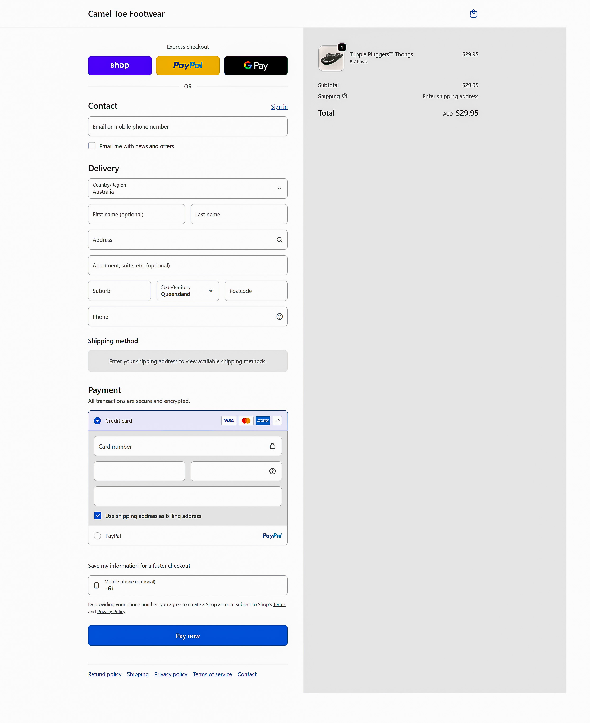
A real checkout path with real store proof
This project is useful because it shows a real buying journey, real store data, and a live ecommerce setup that customers actually used.
- • Real Shopify storefront
- • Real product and variant flow
- • Real checkout activity
- • Real orders and revenue
This project proves I can build stores that look better and function in the real world
The point is not just that the store looked cleaner. The point is that it became easier to use, easier to trust, and capable of generating real sales activity from a live audience.
Build a store that makes buying feel easier
If your store looks rough, feels confusing, or makes shoppers work too hard, it might be quietly hurting sales.