FIFO Resume Mate
A clearer landing page, product output section, pricing structure, and builder flow for a digital product built around FIFO resume help.
A digital product page built to explain the offer and move visitors toward purchase.
Make the product, pricing, output, and next step easier to understand.
Better page flow from the first message through sample output, pricing, and builder.
Built to explain the offer quickly and guide people through the process
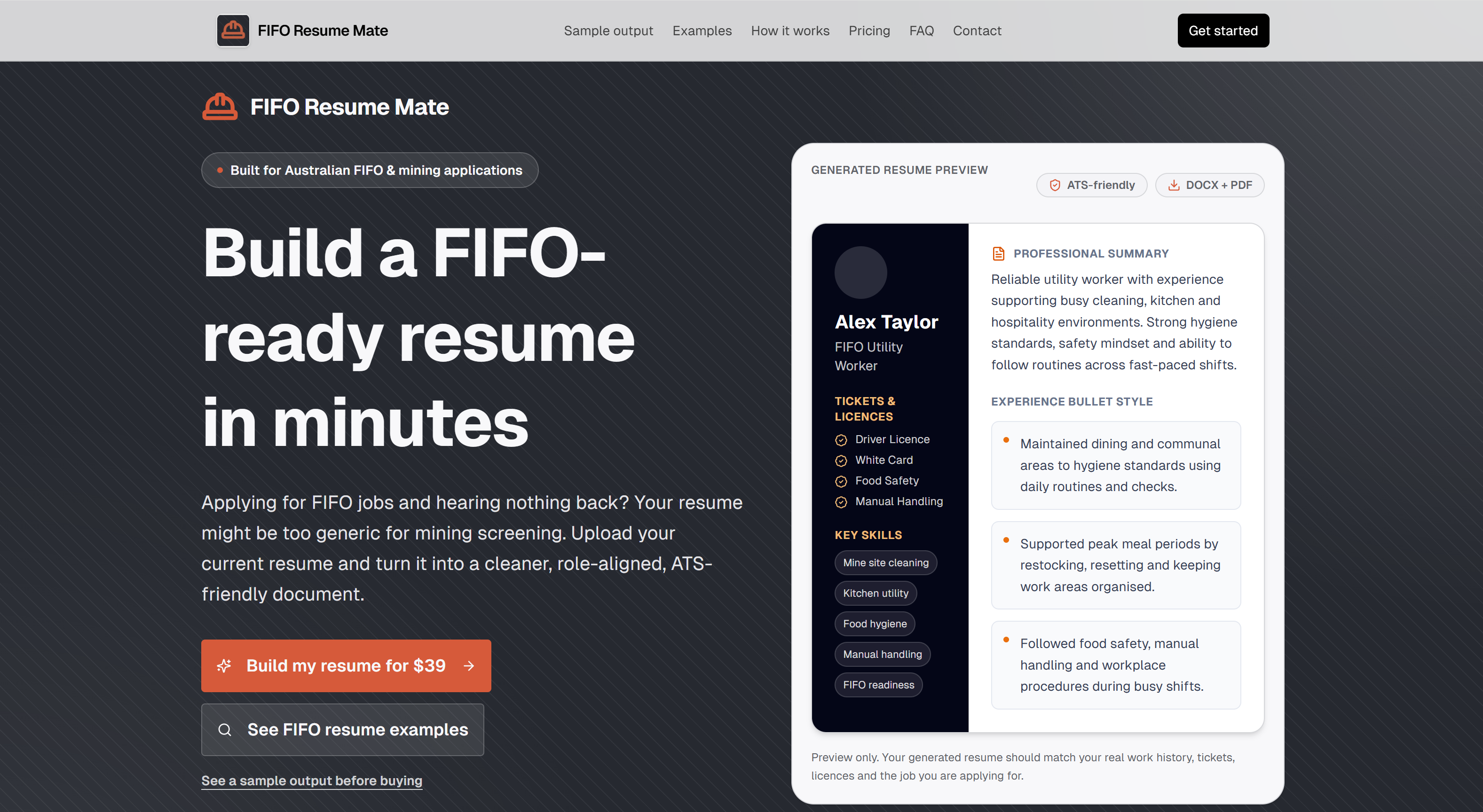
For a digital product, the page has to do a lot of work. Visitors need to understand the offer, see what they get, choose the right option, and know what happens next.
The page needed to make the product easier to understand
Visitors had to understand what was included, which option suited them, and what the finished output looked like without feeling overwhelmed by the process.
Clearer structure, product proof, pricing, and builder flow
The improvements focused on making the offer easier to follow and helping visitors move through the buying journey with less hesitation.
Key parts of the website flow
These screenshots show the main points in the journey, from product output to pricing to the builder.
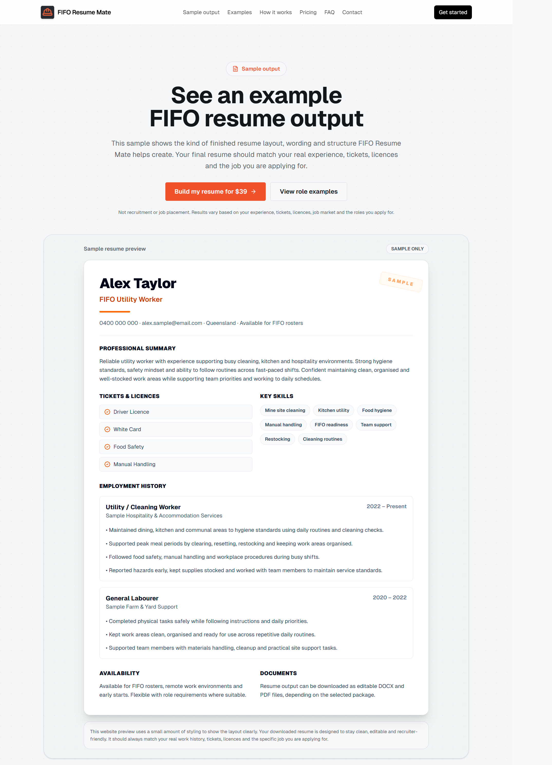
Show what the customer actually gets
The sample output section helps visitors understand the finished product before they buy, which makes the offer easier to trust.
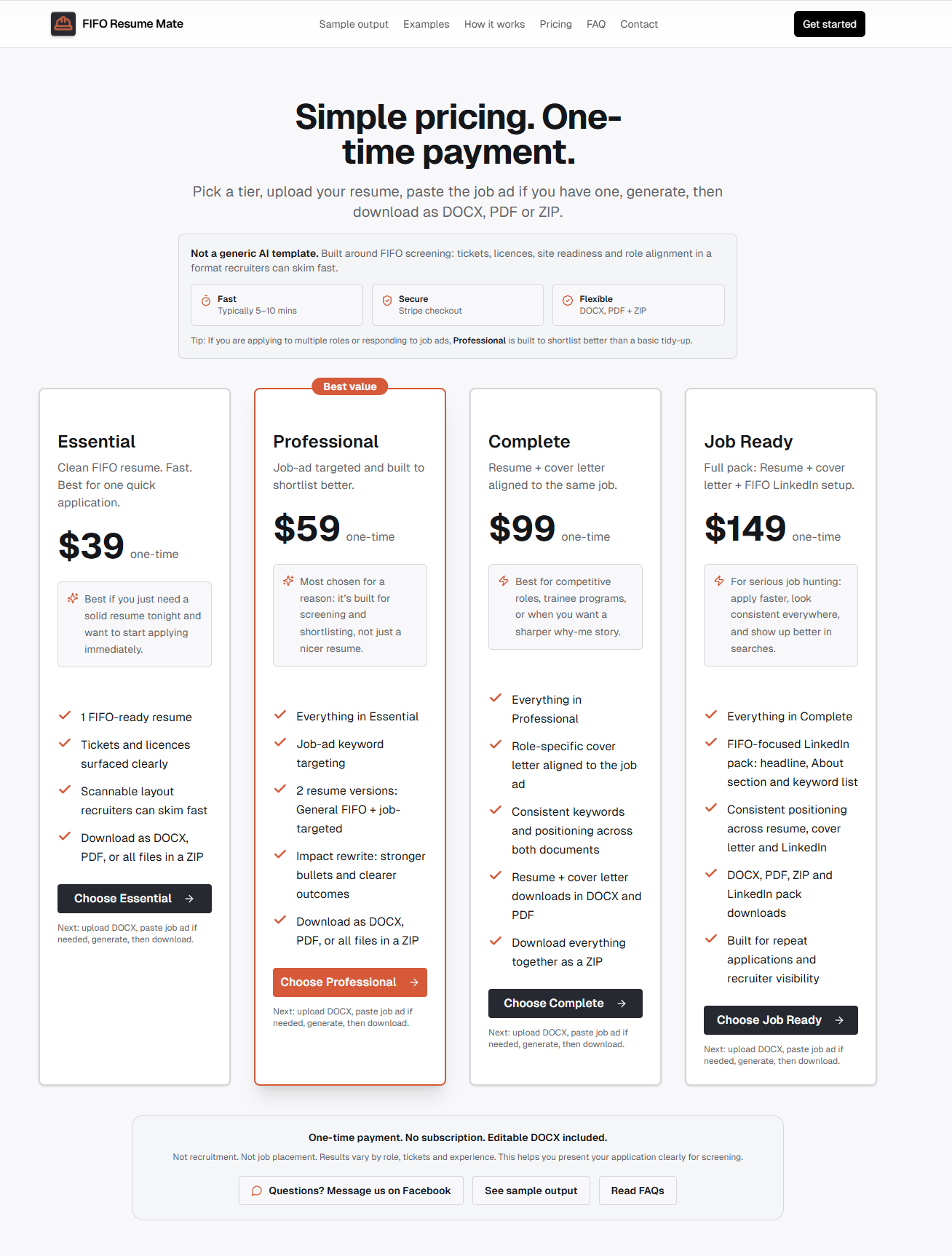
Clearer pricing and package options
The pricing section was shaped to make each option easier to compare, with stronger positioning around the best-fit choice.
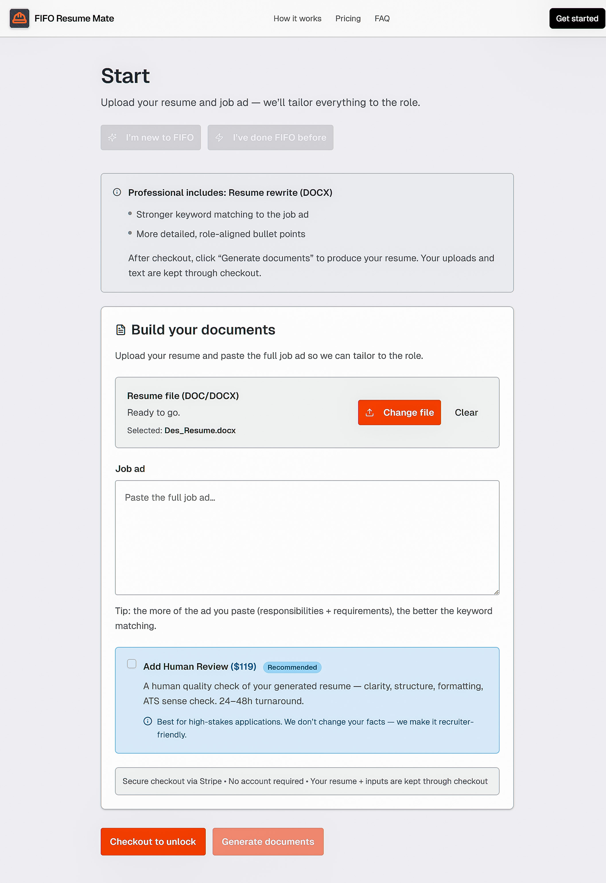
A smoother path from upload to action
The builder page guides people through uploading their resume, adding the job ad, and understanding what happens next.
Designed to make the next step feel obvious
The page had to make the offer feel clear enough that visitors could move from reading to understanding the product, choosing an option, and starting the builder.
The page explains what the product is, who it is for, and what the customer gets.
The pricing section was shaped to reduce hesitation and make the buying decision simpler.
The sample output helps people see the value before they start the process.
The page structure guides visitors from interest to action without unnecessary confusion.
This project shows how a landing page can make an offer easier to understand and easier to buy
The point is not just surface polish. The page needed to help people understand the product, trust the process, and move smoothly toward the next step.
Build a page that explains the offer and points people toward action
If your offer is good but the page feels confusing, unclear, or clunky, that friction can quietly cost you sales.